
Categories
DesignPublished April 8, 2026
Sherwin Williams Hottest White Paints 2026

Sherwin Williams Hottest White Paints 2026
I have a confession: I am a white paint junkie. I know that sounds ridiculous, but if you've ever stood in a room where the white was just right — where it made the trim glow and the floors look richer and the whole space felt like a deep breath — you know exactly what I'm talking about. White isn't boring. White is everything. It's the foundation that makes every other choice in a home sing. And right now, we are living in a golden age of white paint. Sherwin-Williams in particular is doing things with their whites that have me genuinely giddy.
As someone who builds custom homes in Fort Mill, SC and selects finishes for a living, I spend more time thinking about white paint than most people spend thinking about their entire color palette. So let me share my favorites, what's new, and why the white conversation just got a whole lot more interesting.
My Personal Favorites: The Whites I Keep Coming Back To
I could talk about dozens of whites, but there are three that live rent-free in my head — and on my walls.
Sanctuary SW 9583
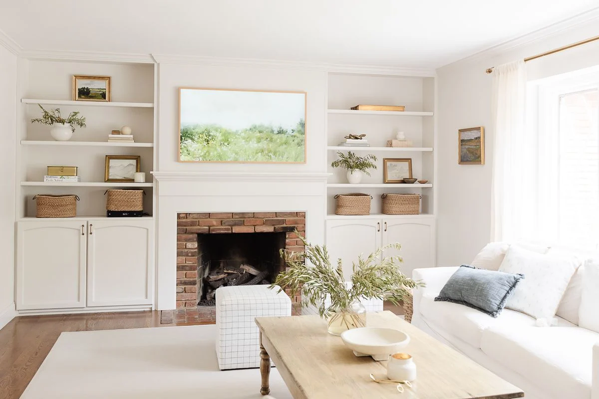
Oh, this color. This color. Sanctuary is part of the 2026 Colormix Forecast's Foundational Neutrals palette, and the name could not be more perfect. It's a soft, warm white-adjacent neutral — imagine the color of candlelight on linen, or the inside of a seashell. It's not quite white, not quite cream, not quite beige. It's this gorgeous, warm, enveloping something that makes every room feel like a hug.
I love Sanctuary so much that I color-drenched my entire design studio in it. Walls, trim, ceiling — all Sanctuary. Every surface. And the effect is absolutely stunning. When you color-drench a room — meaning you use the same color on everything — it creates this seamless, cocoon-like feeling where the architecture just wraps around you. There are no visual interruptions. Your eye doesn't bounce between the wall color and the trim color and the ceiling. It all just flows. And Sanctuary does it beautifully because it has enough warmth and depth to feel rich on every surface, even on the ceiling. It doesn't wash out or go flat the way a pure white would in a full-drench application.
Photo source: Sherwin Williams
I'll be doing a full blog post on the studio design soon — the whole process of choosing the color, the sheen decisions for each surface, how it looks at different times of day, and why color-drenching is having such a moment right now. Stay tuned for that one. But I'm telling you — if you're thinking about a whole-home neutral or a statement room that feels warm, sophisticated, and intentional, Sanctuary deserves a spot on your sample wall.
Snowbound SW 7004
Snowbound is my cool white. If Sanctuary is a warm hug, Snowbound is a crisp linen shirt — clean, fresh, and just barely off-white with the slightest gray undertone. It has an LRV of 83, so it's bright without being blinding. And it's incredibly neutral — it doesn't lean too warm or too cool in most lighting conditions, which makes it one of the most versatile whites in the Sherwin-Williams lineup.
I reach for Snowbound when a client's fixed elements — floors, countertops, tile — have cooler undertones. Gray-toned LVP, white marble, cool-toned quartz, chrome or brushed nickel hardware — Snowbound plays beautifully with all of it. It's also a fantastic trim color when your walls are a warmer neutral, because it creates a clean, subtle contrast without going stark. In our custom builds here in Fort Mill and Indian Land, I use Snowbound constantly. It's one of those colors that never lets me down.
Greek Villa SW 7551
And then there's Greek Villa — my warm white. This one has soft, creamy undertones with just a whisper of yellow-beige warmth. It has an LRV of 84, so it's plenty bright, but it glows. Especially in rooms with lots of natural light — and here in the Charlotte metro, we get gorgeous natural light — Greek Villa makes everything feel sun-kissed and inviting without ever reading yellow.
I love Greek Villa on cabinets. In a kitchen with warm wood floors, brass or gold hardware, and natural stone countertops, Greek Villa cabinets look absolutely dreamy. It's also beautiful as a whole-home wall color for clients who want that warm, light, and bright feeling everywhere but don't want stark white. It pairs wonderfully with both warm accent colors and cooler tones — you can throw a moody green like Garden Gate or a deep navy like Inkwell next to Greek Villa and they both look incredible. It's that versatile.
[INSERT PHOTO: Kitchen with Greek Villa cabinets paired with warm wood floors and brass hardware]
The Designer Color Collection: Pure + Pristine Whites
Okay, let me tell you about something that's been a big deal in the design world — and honestly, I think it's one of the most important things Sherwin-Williams has done in years.
The Designer Color Collection is a curated suite of colors developed specifically with designers and builders in mind. It includes six palettes of designer-favorite hues. But the one that matters most for this conversation is the Pure + Pristine palette — 40 of the brightest, cleanest, most beautiful whites Sherwin-Williams has ever offered, all made possible by their UltraWhite SW 9500 base.
The Pure + Pristine palette is organized into two groups: Warmth + Wonder (warm whites like Alabaster, Greek Villa, and Cream and Sugar) and Light + Luminous (cool whites like White Snow, Snowbound, and Extra White). They're arrayed by light reflectance value, which makes it incredibly easy to compare and find exactly the right white for your project. As Sue Wadden, Sherwin-Williams' director of color marketing, put it — the brightest, purest whites that homeowners and designers have been asking for are now possible because of this base.
For someone like me who specs whites for entire custom homes, this collection has been a game-changer. It takes so much of the guesswork out of choosing whites, because they're curated by undertone family and brightness level. I can walk a client through the Pure + Pristine deck and help them find their perfect white in a fraction of the time it used to take.
The UltraWhite Base: And Why It's a Bigger Deal Than You Think
Here's the part that gets a little nerdy — but stick with me, because this matters if you care about getting your whites right.
When you tint paint, you're adding colorant to a base formula. And that base has its own slight tint, which affects the final result. For years, even the "whitest" bases had just enough warmth or cloudiness to shift how lighter colors turned out on the wall. The result? Whites that didn't quite match the swatch. Creams that read a little off. Frustrating, especially when you're building a whole-home palette around white.
Sherwin-Williams' UltraWhite (SW 9500) base is their brightest, cleanest, most neutral white formulation. By starting with a purer base, the colors mixed from it are more accurate to what you see on the swatch. Better color accuracy, truer undertones, less of that "why doesn't this look like what I picked?" frustration.
But here's where it gets really interesting for our clients — and this came up in conversation with our Sherwin-Williams rep:
Sherwin-Williams Can Now Color-Match Benjamin Moore's Top Whites
Let's be honest — for years, Benjamin Moore owned the conversation when it came to premium whites. Colors like Chantilly Lace, White Dove, and Swiss Coffee became the go-to whites for designers across the country. And for good reason — they're beautiful colors. But getting a true match in a Sherwin-Williams product was always tricky, because the base just wasn't clean enough to replicate those crisp, pure tones accurately.
That's changed. The UltraWhite base has given Sherwin-Williams the ability to color-match Benjamin Moore's most popular whites with a level of accuracy that wasn't possible before. So if you love the look of Chantilly Lace but prefer to work with Sherwin-Williams products — or if your builder (hi, that's me) has a Sherwin-Williams account and relationship — you can now get a match that's genuinely close. Same goes for White Dove and Swiss Coffee.
This is a big deal for custom home builds. At The Vining Group, we work with Sherwin-Williams because we have a strong relationship with our rep, we trust the product performance, and the Cashmere, Duration, and Emerald lines are what I want on my walls and cabinets. But some of our clients come in with Benjamin Moore color inspiration — maybe from a magazine spread or a Pinterest board or their last home — and being able to match those specific whites accurately, in our preferred products, is a huge win. It means our clients don't have to compromise on either the color they love or the product performance they need.
[INSERT PHOTO: Crisp white trim against a warm-toned wall — showing clean, bright white with no yellowing]
The Other Whites I Love (and Where I Use Them)
Beyond my top three, here are a few more whites that show up constantly in our Fort Mill and Charlotte metro custom builds:
White Snow SW 9541
This is a Designer Color Collection pick that showed up in both the 2025 Color Capsule and the 2026 Colormix Forecast. It's a bright white with the faintest hint of cream — just enough warmth to keep it from feeling clinical, with an LRV of 90. White Snow on trim with a warm wall color is one of my favorite combinations right now. It reads clean in every light condition I've seen it in.
Alabaster SW 7008
The 2016 Color of the Year and still one of the most popular whites in America for a reason. Alabaster is a warm, creamy white with soft yellow undertones that gives rooms a cozy, welcoming glow. I recommend Alabaster for whole-home white palettes when clients want everything light and bright but don't want that "operating room" feel. It flatters skin tones beautifully, too — which sounds funny to say about a wall color, but if you've ever stood in a room with cool blue-white walls and felt washed out, you know exactly what I mean.
Extra White SW 7006
This is the crispest, brightest white Sherwin-Williams offers. It's about as close to a "true white" as you'll get in paint. I use Extra White when I want high contrast — dark walls with bright white trim, or a modern aesthetic where the white needs to really pop. It's also a great ceiling white in rooms with warmer wall colors, because it keeps the ceiling feeling clean and expansive without competing.
Pure White SW 7005
The workhorse. A true neutral — not warm, not cool, just clean. I use Pure White constantly for trim in homes where the wall color could go either direction. It plays nicely with warm tones and cool tones alike. If you're building and you're not sure which direction your selections will go, Pure White on all trim and doors is a safe and beautiful starting point.
How to Choose the Right White for Your Home
Here's my quick framework — the same thing I walk through with every client at The Vining Group:
Look at your fixed elements first. What color are your floors? Your countertops? Your tile? If your fixed elements lean warm (warm-toned hardwoods, cream tile, golden granite), reach for a warmer white like Greek Villa, Alabaster, or Sanctuary. If your fixed elements are cooler (gray-toned LVP, white marble, chrome fixtures), a crisp white like Snowbound, Extra White, or Pure White will feel more cohesive.
Consider your light. Rooms that get a lot of natural light can handle a warmer white without it reading yellow. Rooms with less natural light — or rooms lit primarily by warm-toned bulbs — may push a warm white too far. In those spaces, a neutral or slightly cooler white keeps things clean.
Think about contrast. Are your walls going to be a rich, warm color like Universal Khaki or something from the Restorative Darks palette? Then a crisp, clean white on trim creates beautiful definition. If your walls are already a soft white or very pale neutral, matching the trim to a similar warmth level keeps everything cohesive and layered instead of choppy.
Always sample. I can't stress this enough. Buy the large sample sizes — or better yet, grab peel-and-stick samples — and test them in the actual room. Look at them at 8 AM, noon, and 8 PM. You'll be surprised how different the same white can look.
White paint sounds simple. It's anything but. And when you get it right — when you find your white, the one that makes your home feel warm and bright and perfectly you — it's honestly one of the most satisfying things in the world. If you're building a custom home with us or even just refreshing your current space, let's talk whites. I promise it'll be a better conversation than you think.
More From This Series
This is part of a series on everything paint for your home. Don't miss the rest:
How Sherwin-Williams Picks Their Color of the Year — The behind-the-scenes process from fashion shows to Cleveland HQ, plus the nail polish tradition you need to know about.
Paint Sheens Explained: A Builder's Guide — Flat, eggshell, satin, semi-gloss — plus Cashmere, Duration, and Emerald and where I use each one.
The Hottest Paint Colors for 2026: Warm Is In, Cool Gray Is Out — Restorative Darks, Foundational Neutrals, and the colors I'm most excited about right now.
Kristin Vining is a licensed Realtor and custom home builder with The Vining Group at eXp Realty, partnered with OZ Custom Homes in Fort Mill, SC.
📧 kristin@teamvininggroup.com
🌐 teamvininggroup.com
📸 @KristinVining
|


or another way